Peak Design System
Problem
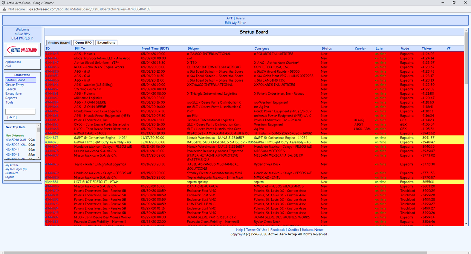
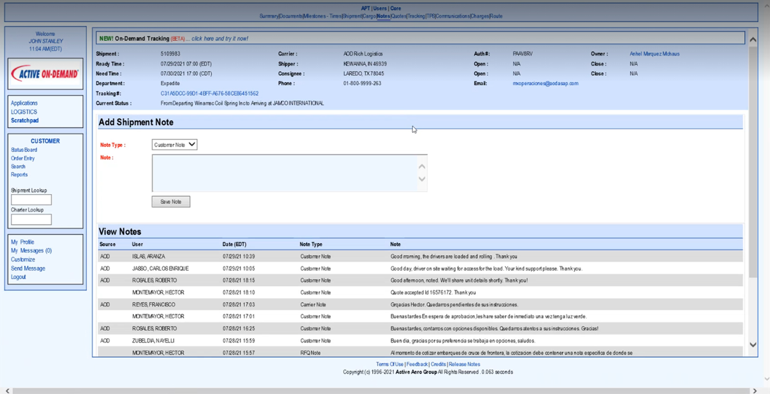
Ascent Global Logistics operated three distinct business outlets—On-Demand, Forwarding, and Brokerage & Managed Transportation—as silos. Each vertical functioned as a separate product used by different business personas, resulting in a fragmented user experience. Internally, there was no unified design system, and the existing branding was limited and not fully "flushed out" for digital products. This lack of standardization led to high design debt, inconsistent interfaces, and a disjointed brand identity that struggled to scale with the business.
Challenge
Build the PEAK Design System from the ground up to serve as the foundational UI framework for all three business outlets. The mission was to create a cohesive visual language that allowed each product to meet its specific functional needs without deviating from the overarching Ascent brand.
Opportunity
With full creative freedom, I transformed Ascent’s limited brand guidelines into a robust, accessible, and developer-friendly ecosystem. This initiative focused on three strategic pillars:
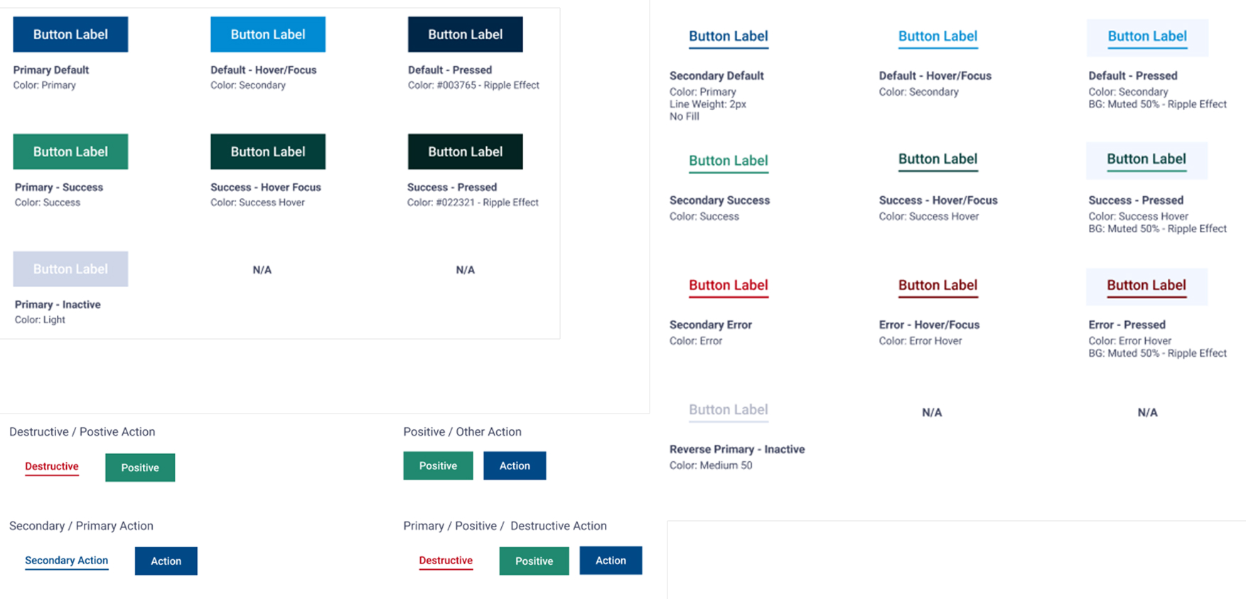
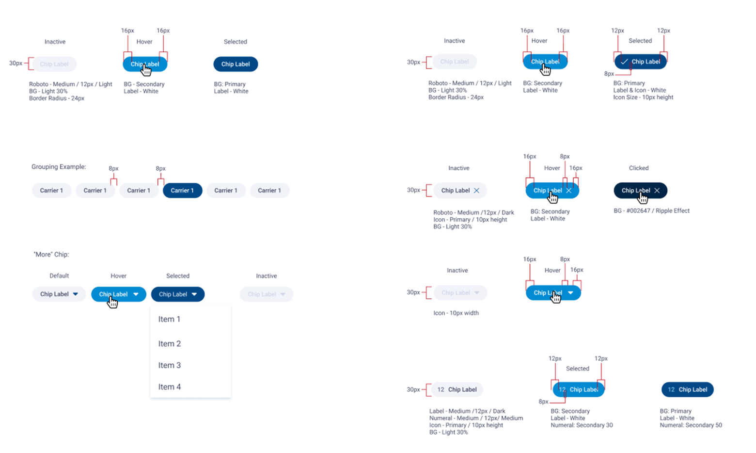
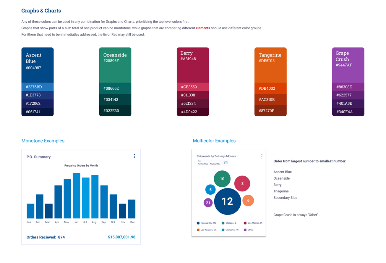
- Unified Visual Identity: I expanded the brand's digital presence by creating a custom icon library from scratch and defining a comprehensive UI kit that balanced the high-intensity needs of logistics (data-dense tables and dashboards) with modern aesthetic standards.
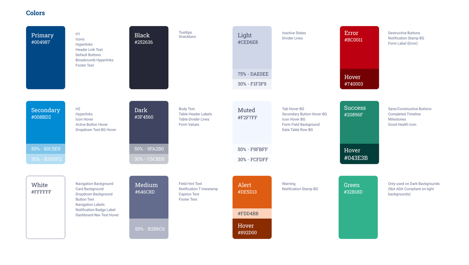
- Accessibility & Inclusion: I leveraged the "from scratch" nature of the project to bake WCAG compliance into the foundation, ensuring color contrast, typography, and interactive elements were accessible to all users across the supply chain.
- Design-to-Dev Synergy: To ensure the system was truly functional, I collaborated with a dedicated cross-departmental developer to launch a Storybook instance. This bridged the gap between Figma and production, providing a single source of truth for both designers and engineers.
- Scalability for a Lean Team:Working within a small team for a large organization, I prioritized the creation of reusable, flexible components. This allowed us to support three massive business units with high efficiency, reducing the need for repetitive design work and accelerating time-to-market for new features.
The Transformation: From Fragmentation to PEAK Performance
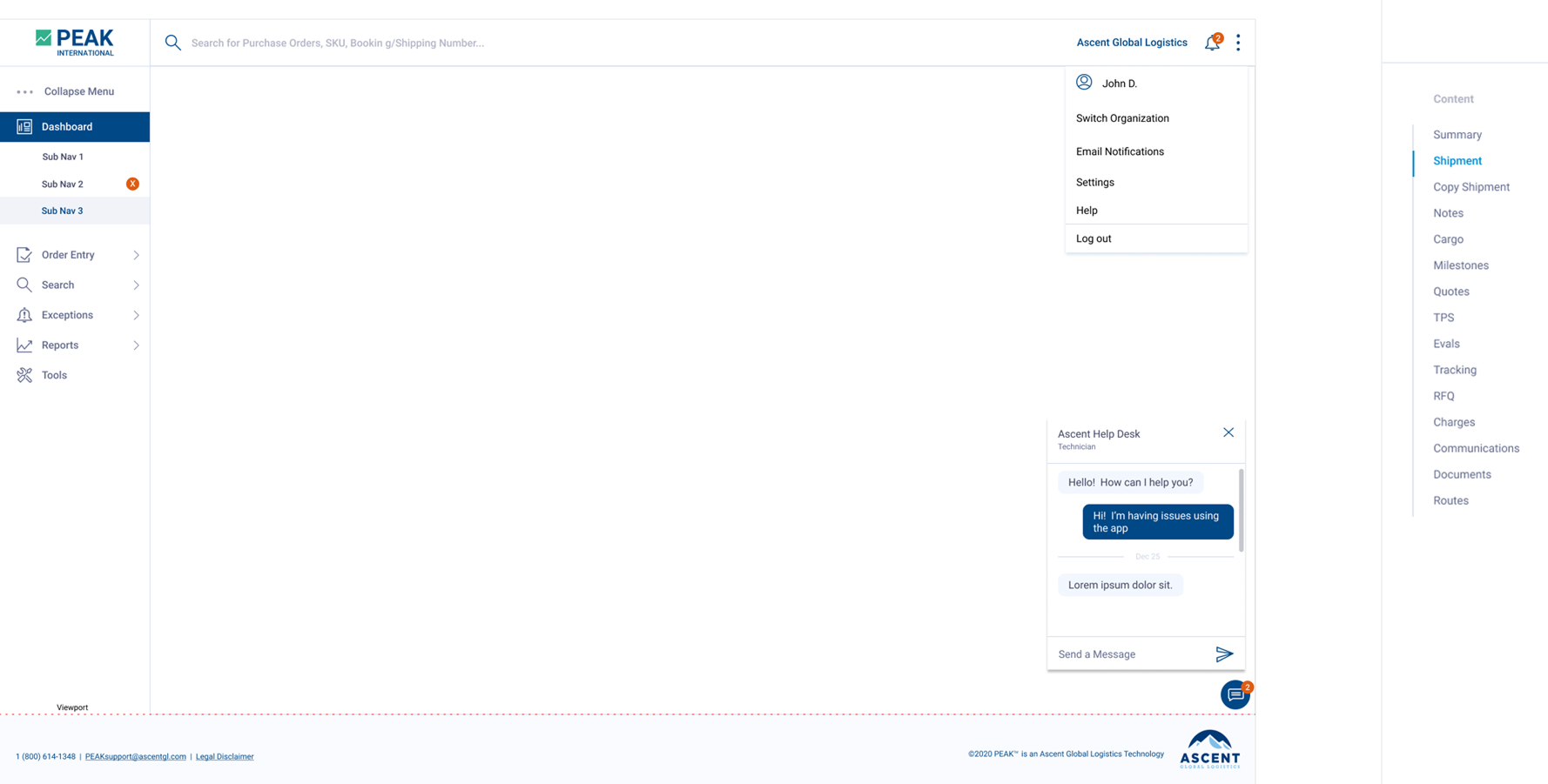
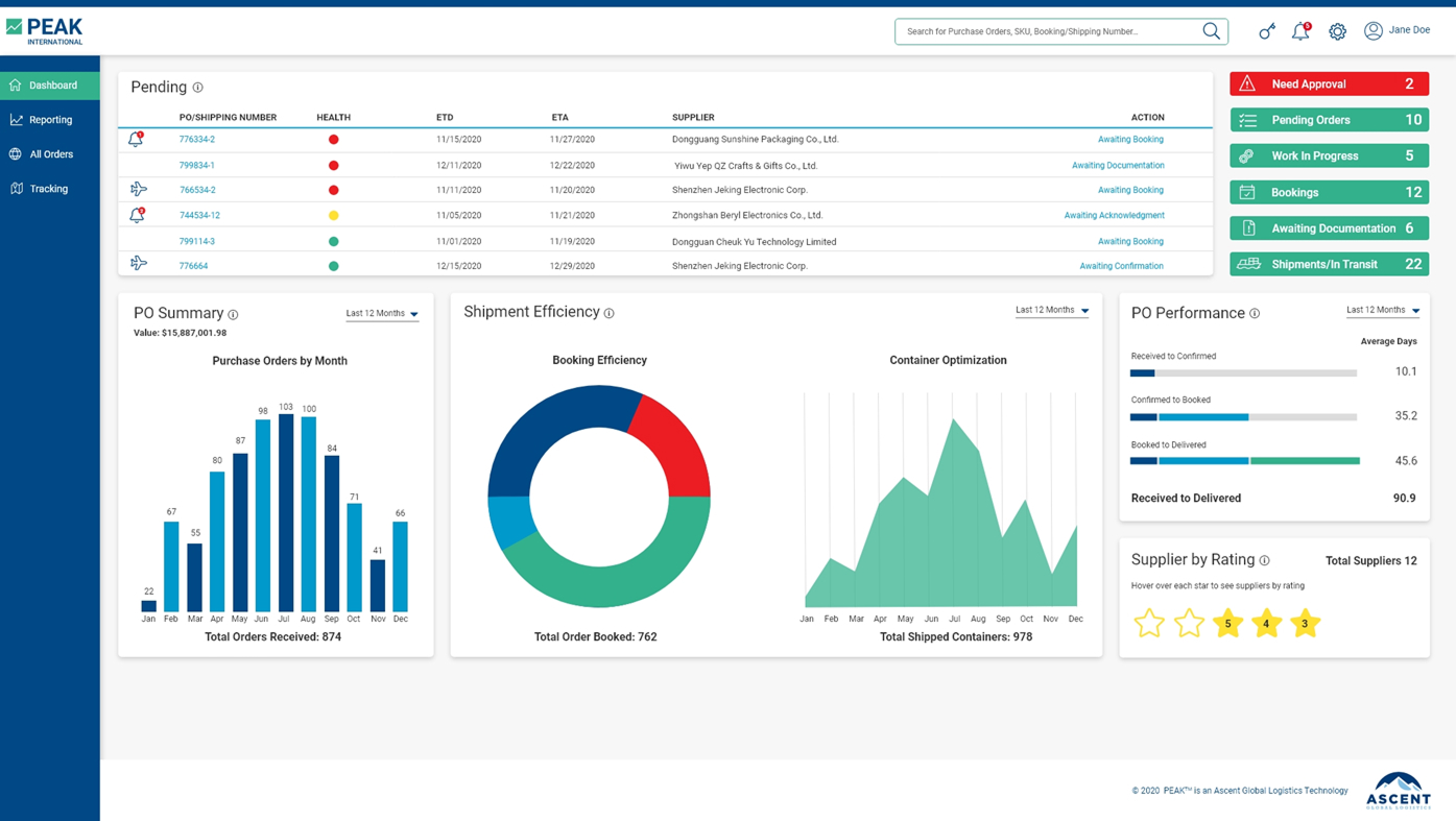
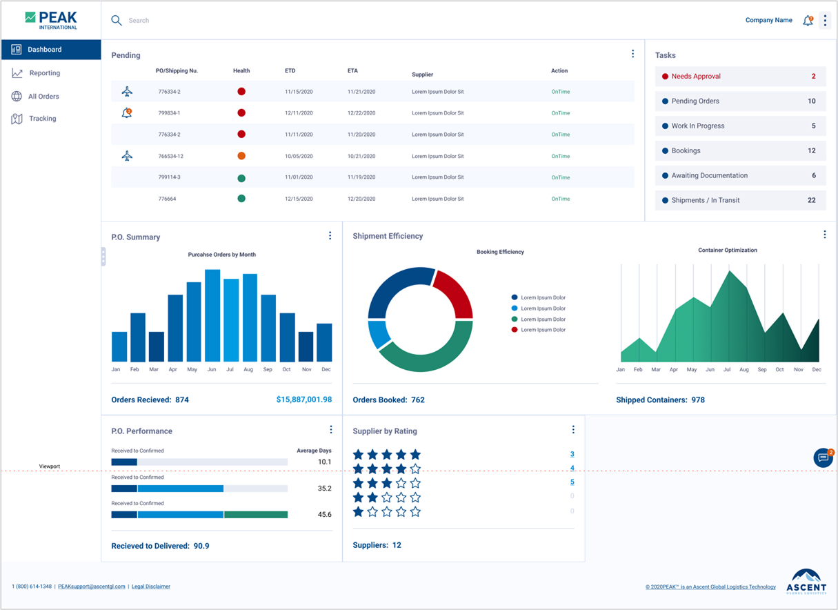
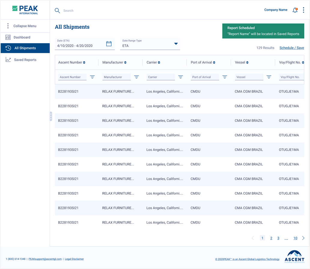
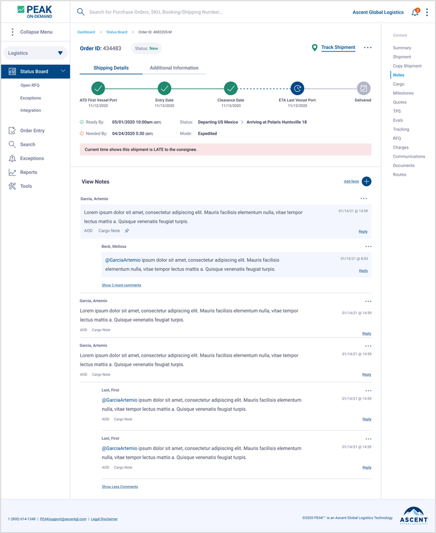
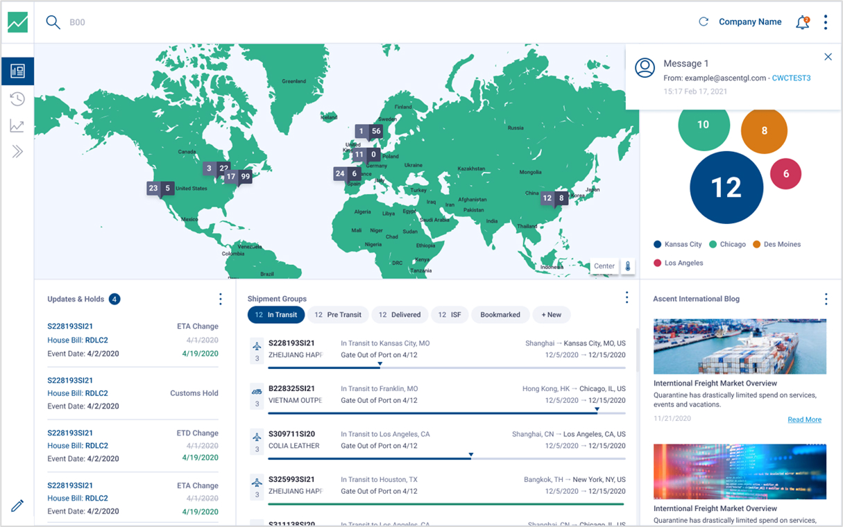
Before the PEAK system, Ascent’s tools were essentially "walls of data" that made it difficult for users to know where to look first. With no clear hierarchy, everything felt equally urgent, leading to a cluttered and exhausting user experience. I redesigned these interfaces to move away from just displaying information and toward guiding the user through their workflow.
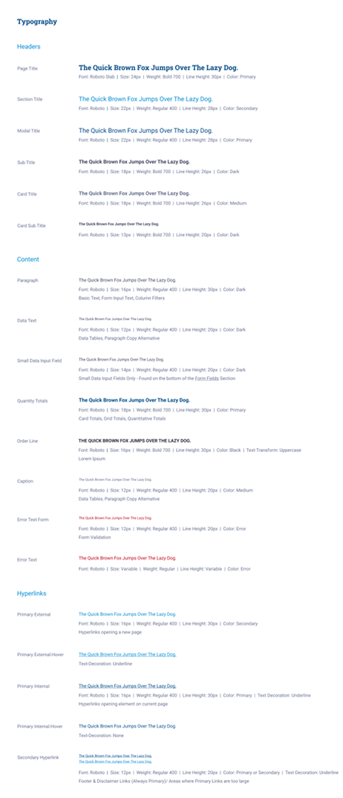
I established a solid visual structure that makes dense logistics dashboards much easier to read and navigate. By introducing consistent spacing, better typography, and logical content grouping, I made it possible for users to scan complex data at a glance. Most importantly, I integrated accessibility from the start—fixing contrast issues and ensuring a smooth, predictable flow across all three business outlets. The final result is a cleaner, more inclusive platform that feels like a cohesive tool rather than a collection of separate apps.
Before
After
Before
After
Customizable Dashboard
The Design System
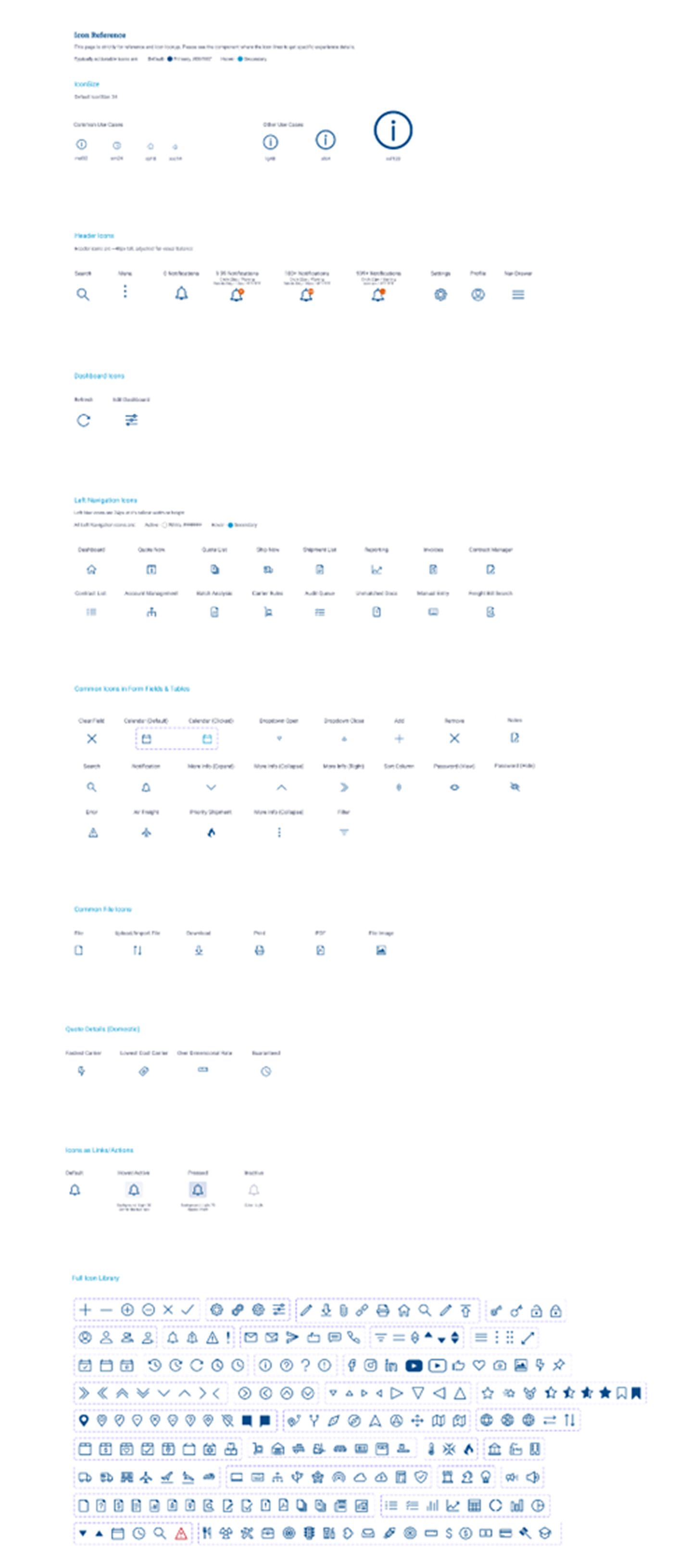
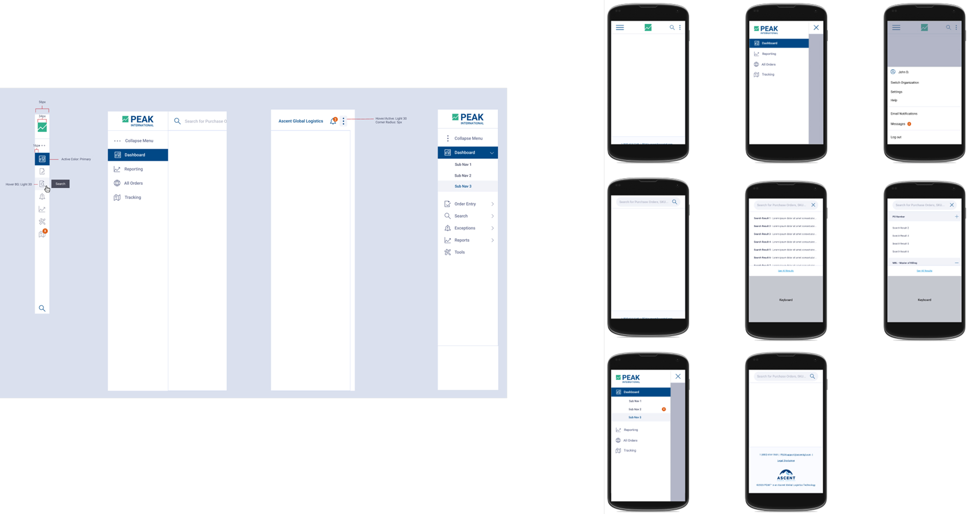
Custom Icon Library
Designed a comprehensive, custom icon library tailored to the logistics sector. By creating proprietary symbols for niche business needs, I eliminated the ambiguity of generic icon sets, ensuring that users in Forwarding, On-Demand, and Brokerage could identify key actions and statuses at a glance.
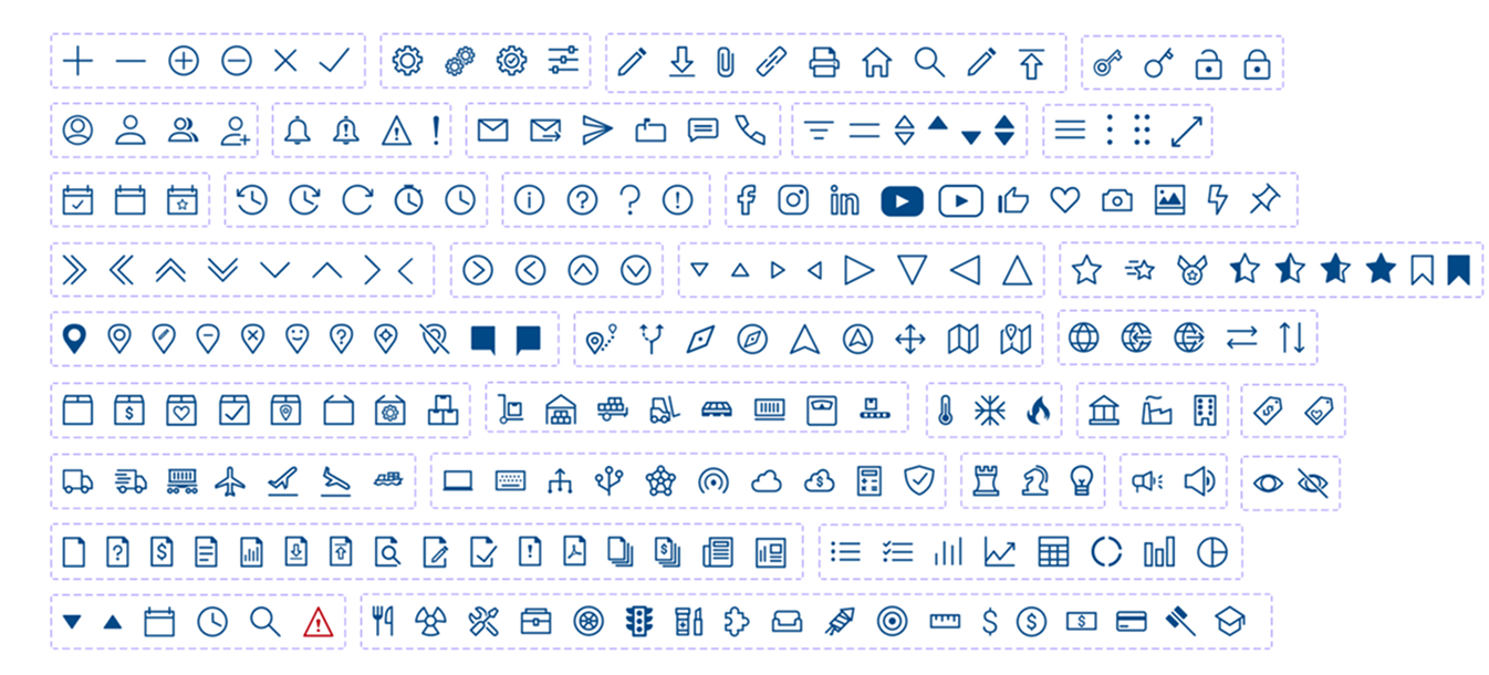
Additional Library item Examples